Responsive Design Implementation has made it easier for users to access websites seamlessly across various devices, including smartphones, tablets, and desktops. With the growing trend of content consumption on mobile, Responsive Design Implementation has become essential for enhancing user engagement and achieving better search engine rankings.
Why Responsive Design Matters in 2025
A decade ago, responsive web design was viewed as an innovative idea. Now, in 2025, where web access comes from smartphones, tablets, laptops, desktops, smart TVs, and even wearables, having all devices be able to access the web seamlessly caters to user satisfaction. There are no exceptions for this. Responsive design ensures that strategic placement of images, texts, and navigation menus in conjunction with devices allows the user to access and navigate all pages easily.
The Rise of Mobile-First Browsing
On a global scale, browsing on mobile devices now captures the most internet traffic, sitting at 65% and above, which is now giving competition to all website developers because mobile-friendly design is now a requirement for retention. Users are looking for sites with quick load times and easy navigation from their phones and tablets. If a particular site does not meet these standards, it will likely lose customers to other competing sites. Through responsive design, any user, no matter what device they are using and whether it’s a phone or a computer, is guaranteed easy access to all content while ensuring it remains visually pleasing. This drives a reduction in bounce rate and an increase in user engagement.
Impact on SEO and User Engagement
The ranking of algorithms, as well as indexing on Google, emphasizes mobile-friendly sites and those that are responsive. A responsive website includes all content in a single URL instead of having multiple domains for the same site, which duplicates content and splits link equity. This methodology is more efficient at improving SEO, site speed, and sending usability metrics, which improves ranking with search engines. Furthermore, SEO metrics are improved through responsive design by users, and user engagement is a primary factor as users are more willing to spend time converting when they feel catered to.
Accessibility and Inclusive Design
Responsive design prioritises inclusivity and equal accessibility more than anything else. Users with disabilities and other unique requirements that limit the devices they can benefit from being catered for alongside everyone else. This expands the pool of audience that legally needs catering, ultimately improving satisfaction and strengthening organizational goals. Accessible text that can be read or interacted with, and touch navigation that is present, make digital experiences work for everyone.

Core Principles of Responsive Web Design
Several tools are implemented in responsive web design to ensure the seamless adjustment of websites to any device and screen size.
Fluid Grids and Flexible Layouts
Changing the viewport width proportionally scales the content, like fluid grid layouts, utilizing relative units such as % rather than fixed pixels. Because of such flexibility, harmony is produced when viewing the device through columns, images, and other elements, preserving their relation and spacing.
Media Queries and Breakpoints
CSS media queries are necessary for any responsive design because they allow different styles based on the device width, orientation, and resolution, among other characteristics. Breakpoints specified widths where the layout alters are set to maintain content usability and readability on smartphones and large desktop monitors.
Scalable Images and Adaptive Media
Responsive media and images change in size and resolution based on the user’s device. SVGs alongside srcset with newer image formats ensure a drop in distortions and bandwidth preservation without loss in visuals, delivering optimal load speeds.
Mobile-First Approach
A mobile-first policy assumes that designing starts from the smallest screen and works upwards to the larger screens. Critical mobile usability and content are pushed to the forefront, while features for tablets and desktops are layered in. This approach maximizes reach to device users while increasing speed and efficiency with minimal effort.
Responsive design is the best approach in web development, as it improves SEO rankings, traffic, and overall usability.
Essential Techniques and Tools for Responsive Design Implementation
Combining cutting-edge techniques and robust tools for multi-device user experience enhances modern web design. The basic responsive design methods include adaptable layouts, content optimisation, and usability while considering screen size and device type.
Using the Viewport Meta Tag
Responsive designs heavily rely on viewport meta tags. A viewport meta tag enables webmasters to instruct on the required zoom level and horizontal scrolling of the webpage, thereby preventing over-zooming and scroll issues. The most common application is written as below:
xml
<meta name=”viewport” content=”width=device-width, initial-scale=1.0″>
This tag ensures the website’s layout is proportional to the device, so mobile users enjoy a clear and measurable experience.
CSS Flexbox and Grid for Dynamic Layouts
New and modern CSS layout systems, such as Flexbox and CSS Grid, have transformed the world of responsive design and claimed ease of use. While Flexbox is best for one-dimensional layouts, CSS Grid works magic for two-dimensional ones. They all use media queries and proportional units for content arrangement, which applies to mobile-adaptable navigation bars, galleries, and content sections.
Responsive Typography and Spacing
Responsive typography ensures text is readable and visually appealing for different screen sizes. Automatically adjusting scale font size with FitText or relative units em, rem, vw, and vh head towards viewport-dependent calculations; viewport scaling enables devices to change font sizes and headings proportionally to their viewport. Likewise, responsive spacing employs a flexible approach towards margins and paddings, ensuring that small and large screens maintain an aesthetically balanced layout.
Testing Responsiveness with BrowserStack and DevTools
Testing responsiveness aids in validating your site’s adaptability. Responsinator, BrowserStack, and DevTools offer previews and debugging on multiple devices and screen sizes, helping you check integrated layouts. Gaps in layouts and seamless transitions across devices like desktops, tablets, and mobile devices can be tested to ensure breakpoints enable consistent performance.
Step-by-Step Guide to Building a Responsive Website
The process for creating responsive websites is systematic. First, the HTML structure is tendered, and later, performance is optimized for speed, ensuring your site serves its purpose efficiently.
Structuring HTML for Flexibility
Use semantic, concise HTML, which enables easier style application and rearranging with content hierarchy. Styles can be applied alongside fluid layout, enabling advanced scaling.
Implementing Fluid Containers and Relative Units
Use Bootstrap’s container-fluid. Elements are set in width and height and positioned and sized in relative units (em, rem) to screens, giving them greater adaptability without breaking the layout.
Applying Media Queries for Device Adaptation
To set media queries, you define breakpoints that allow you to change styles for mobile, tablet, and desktop views to ensure optimum readability and usability at every level. This capability targets device features, such as screen width and mobile orientation.
css
@media (max-width: 768px) {
body { font-size: 14px; }
}
Optimizing Navigation for Touch and Click
Navigation must be easy to find and logical to follow on all devices. Make larger touch targets, touch-friendly menus, and collapsible navigation bars for mobile devices. These touch controls are also available in responsive frameworks like Bootstrap, which offer ready-made components that you can use immediately.
Ensuring Performance and Fast Load Times
Resources should be well managed if you want to retain users. Performance needs to be at the top of the checklist. Adaptable image formats, CSS and JavaScript file minification, and reduction of code bloat using responsive frameworks all help optimize images. Always check how fast your site is and how responsive it is, making changes where necessary to ensure every device has a fast and smooth experience.
Meeting today’s ever-changing needs requires combining the above-mentioned basic tools and techniques to build websites that enhance usability and accessibility while maintaining optimum performance.
Responsive Design Implementation

Ready to Transform Your Website with Responsive Design?
✅ Deliver a consistent experience across all devices
✅ Improve user engagement and lower bounce rates
✅ Boost SEO with mobile-friendly, adaptive layouts
Best Practices for Optimizing Website Responsiveness
Optimizing website responsiveness enhances site engagement and improves SEO regardless of the device used. Following best practices guarantees the site provides uniform speed and visual consistency irrespective of the device and browser.
Prioritizing Content for Mobile Users
It is essential to use a mobile-first approach because mobile screens offer limited real estate and users expect quick information retrieval. Key content must be prioritized to present critical information first, then secondary components follow. This approach enhances user satisfaction by delivering essential content faster and improving loading times, which helps to reduce bounce rates. Employ clear content hierarchies, succinct subheadings, and bold call-to-action buttons to facilitate movement around the site.
Consistency Across Devices and Browsers
A consistent feel fosters a cohesive brand experience. Use responsive design with fluid grids, CSS flexbox, and media queries that adapt layouts to work for any screen size. Create a design system that contains reusable elements in set colours and typefaces. Test the site using Chrome DevTools, BrowserStack, or real devices to ensure consistency across browsers and platforms. Ensuring pixel perfection and aesthetic balance gives users consistent quality across devices and platforms.
Accessibility and Usability Standards
Web accessibility ensures your website is helpful for everyone, including people with disabilities. Adhere to the Web Content Accessibility Guidelines (WCAG), paying attention to aspects such as information that can be perceived, navigation that can be operated, user interface comprehension, and robust content. Use proper colour contrast, font legibility, and alt text for images. Make buttons large, easy to tap, and navigable using a keyboard or assistive technology. Enhancing accessibility improves audience reach alongside usability while fulfilling legal obligations.
Regular Testing and Iteration
Refinement and ongoing testing are essential in improving responsiveness. Conduct user testing often to gather feedback on usability and identify user pain points. Adopt iterative design measures: implement feedback-based changes, retest, and refine until user expectations are met. Consistency and improved outcomes require documentation of all changes made. Ensuring that the site and technologies used are up to date increases the effectiveness and competitiveness of the site.
Responsive Design Challenges and Solutions
Responsive design adds flexibility to websites, but can create numerous new challenges. Creating solutions that overcome these obstacles stands out when building high-performing, reliable websites.
Handling Complex Layouts and Navigation
Adapting different devices to fit complex layouts and navigation structures can be challenging. Content organization can be more straightforward if modular components and flexible grid systems are used. Adopting a mobile-first design can emphasise minimalizm and prioritize essential design elements. Hamburger menus or hidden navigation features can significantly reduce clutter while preserving usability on small screens.
Optimizing Images and Videos for Speed
SEO and user experience can suffer if large media files are loaded on responsive sites, which may slow down performance. Images can be optimised by compressing files and using responsive formats such as SVGs and srcset. Bandwidth consumption and initial page load times can be reduced by implementing lazy loading for images and videos, as they will only load when needed.
Managing Legacy Content and Third-Party Integrations
Highly Text Box Legacy content and third-party tools may cause compatibility issues as they lack inherent responsiveness. To address these issues, responsive alternatives should replace outdated elements. Elements that are not responsive can be replaced and thoroughly tested across devices using responsive-friendly plugins or embed codes for third-party integrations.
Following these steps and addressing challenges head-on will make it easy to provide exceptional user experiences, drive engagement, and support business goals in the evolving digital landscape.

Types of Responsive Web Design Approaches
Responsive web design employs several techniques, each with distinct advantages, enabling designers to build universally usable websites on various devices and screen sizes.
Adaptive Design
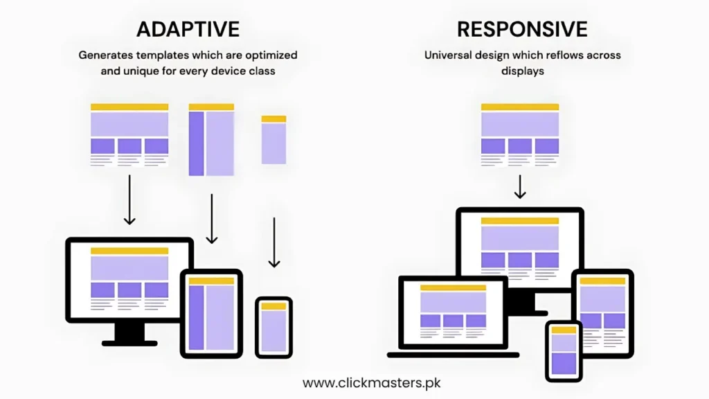
Using adaptive design, multiple layouts for various devices, such as mobile, tablet, and desktop, are set in advance and used for particular screen sizes. The client or server-side scripts determine what layout best suits the device and fetch that layout. While this method is much better for each device, as layouts can be optimized for usability and performance, it requires more work for a designer because multiple site versions necessitate constant updates. This method works particularly well for sites with significant content or functionality divergence across devices.
Fluid Design
Fluid, or liquid design, uses flexible grids and relative units like percentages instead of fixed pixels. This enables the website layout to smoothly stretch or shrink to fit any screen width, ensuring a consistent experience across devices. While fluid layouts are adaptable and work well with numerous devices, they may require additional media query adjustments for extreme widths or tiny screens to enhance usability.
Hybrid Design
Hybrid, or fluid-responsive design, combines the best of both adaptive and fluid approaches. It employs fluid layouts that scale across devices, with additional breakpoints and predefined layouts for specific screen sizes. Therefore, broad flexibility can be paired with targeted optimization to enhance user experience consistency. Hybrid design continues to gain traction because it balances ease of maintenance and layout precision for critical devices.
Responsive vs. Non-Responsive Web Design
Responsive and non-responsive web design techniques and their implications on user experience strategies, business strategies, and business impact decisions require a deep understanding, highlighting the importance of differentiating between them.
Key Differences in User Experience
Responsive web design optimally adjusts content, images, and navigation for all devices without requiring zooming or horizontal scrolling. This allows users to maintain consistent readability, navigation intuitiveness, and information access speed across smartphones, tablets, and desktops. In contrast, non-responsive designs have fixed layouts that do not adapt to smaller screens, resulting in poor usability. Such fixed designs are counterproductive because users will likely become frustrated, negatively influencing visitor demographics and increasing bounce rates.
Business Impact and Conversion Rates
A responsive website can significantly enhance business metrics. Not only does it improve SEO due to Google’s mobile-friendly criteria, but it also increases organic traffic and engagement due to smooth usability across all devices. Enhanced user satisfaction results in prolonged site visits, regardless of the intended action, be it sales, sign-ups, or content consumption, increasing conversion rates. They become less competitive as mobile users shift away from non-responsive sites, resulting in lower search rankings and lost valuable conversions. This illustrates the importance of incorporating responsive design to promote success in today’s digital environment.
Conclusion
Responsive web design focuses on giving the user an experience that is not only seamless but also simple and enjoyable across devices, regardless of whether it is mobile, tablet, or PC. Using adaptive, fluid, or hybrid design approaches guarantees that the business website is accessible, visually appealing, and operating optimally. Responsive design allows websites to be offered, making visiting them even better, improving user experience while supporting SEO ranked pages that are being visited, optimising lower bounce rates, and enhancing modern web development.
Selecting responsive design over non-responsive options is a game-changer for conversion rates and business performance. Responsive websites increase user engagement among mobile users with their phones due to quick navigation and instant loading. Smartphone users will increase their use globally because internet consumption is rapidly transforming into mobile-first, making responsive web design an investment for businesses striving to be competitive and meet users’ demands.


