How does mobile-friendliness affect technical SEO
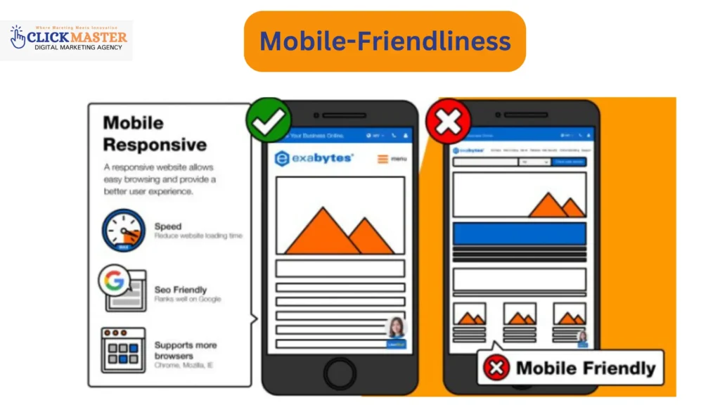
In today’s digital world, technical SEO plays a pivotal role in improving a website’s visibility and functionality for search engines. Among the various elements of technical SEO, mobile-friendliness stands out as a fundamental aspect, especially as mobile devices now account for the majority of internet traffic. Optimizing websites for mobile devices has become a core component of professional SEO services, helping businesses improve both search performance and user experience. Mobile optimization is critical for SEO success and user satisfaction, ensuring visitors can easily navigate and interact with your website across all devices. This guide delves into the importance of mobile-friendliness in technical SEO, exploring its benefits, key elements, and how businesses can leverage mobile optimization and expert SEO services for better search rankings, increased traffic, and stronger user engagement. Importance of Mobile-Friendliness in Search Rankings A mobile-friendly website not only enhances user experience but also significantly impacts search rankings. Since Google’s mobile-first indexing prioritizes sites optimized for mobile, it ranks mobile-friendly sites higher in search results. Studies show that users who experience smooth navigation and fast load times on mobile are more likely to stay longer, thus improving engagement metrics like bounce rate and session duration. These user behaviors positively affect rankings, making mobile-friendliness essential for SEO. Key Elements of Mobile-Friendliness in Technical SEO Achieving mobile-friendliness involves optimizing several key aspects to ensure a smooth experience across all devices. Below are the most critical elements: 1. Responsive Design Responsive design enables websites to adjust seamlessly across different screen sizes, providing a consistent experience for desktop, tablet, and mobile users. A well-implemented responsive design boosts SEO performance, as search engines favor sites that are accessible and visually appealing on mobile. 2. Page Load Speed Mobile users expect fast loading times; slow pages often lead to high bounce rates. To enhance speed on mobile devices, consider compressing images, reducing code, and choosing a fast hosting provider. Each of these elements is crucial for improving the mobile user experience and, consequently, SEO performance. 3. User Experience (UX) A mobile-friendly site prioritizes easy navigation, readable text, and interactive features that engage users. Clear menus, readable font sizes, and seamless interactions make for a better UX, encouraging visitors to stay longer and explore the site, positively impacting SEO. 4. Mobile-Friendly Content Structure Organizing content for mobile consumption is vital for usability and SEO. Use headers, bullet points, and short paragraphs to make the content easy to read on smaller screens. Optimized images and videos enhance accessibility and reduce load times, contributing to a better user experience. Competitor Analysis Process Competitor analysis is essential for understanding mobile-friendliness strategies that top-ranking websites use. Here’s a breakdown of the process: Identifying Top Competitors To get started, identify the top 10 competitors in mobile SEO by looking at keywords like “mobile-friendly design” or “SEO for mobile.” Tools such as SEMrush or Ahrefs help analyze competitors’ domain authority, traffic, and keyword performance, enabling you to focus on the most relevant and high-ranking websites. Keyword Extraction Once you’ve identified competitors, analyze the specific keywords they rank for, especially high-volume terms related to mobile optimization. Tools like Ahrefs or Moz can reveal keywords that drive traffic to competitors’ sites, such as “mobile-first indexing” or “responsive website design.” These insights help you identify important keywords and align your content with what users are actively searching for. Content Gaps and Unique Angles Evaluating competitor content structure, navigation, and keywords can reveal gaps or opportunities. For instance, if a competitor focuses heavily on mobile speed but lacks tips on reducing mobile load times, you could address this gap by offering more detailed insights or interactive tools. This approach not only makes your content more unique but also positions it as a valuable resource in mobile SEO. High-Impact Keywords for Mobile-Friendliness and Technical SEO Selecting high-impact keywords is essential for boosting visibility and attracting a larger audience. Through competitor analysis, you can identify valuable keywords, such as “mobile-friendly SEO tips” and “how to improve mobile SEO,” which often perform well in searches. By choosing relevant keywords focused on mobile optimization, you increase your chances of ranking higher in mobile searches and establishing your site as an authority in the space. Benefits of Mobile Optimization for SEO Performance Mobile optimization directly and indirectly enhances SEO performance: Direct Benefits Mobile-optimized websites rank higher in search engine results due to superior user experiences. Sites optimized for mobile load faster, retain visitors better, and experience lower bounce rates, leading to improved SEO metrics. Indirect Benefits Beyond search rankings, a seamless mobile experience boosts brand credibility. When users trust a website’s functionality on mobile, they engage more with its content, leading to higher conversion rates. An easy-to-navigate mobile site encourages users to make purchases, sign up for newsletters, or explore additional content, driving overall business growth. Key Techniques for Improving Mobile Optimization Achieving a mobile-friendly site requires implementing specific techniques that directly influence SEO. Here are some of the most effective methods: Accelerated Mobile Pages (AMP) AMP enables faster, mobile-optimized pages by eliminating unnecessary elements, allowing pages to load quickly on mobile devices. AMP also meets Google’s speed requirements, boosting user experience and search rankings. Optimizing Images and Videos Compressed images and videos are essential for reducing mobile load times. Responsive images that adjust to screen sizes make content accessible across devices, ensuring a smooth mobile experience. Clean Code and Fewer Redirects Eliminating unnecessary code and redirects minimizes load times, allowing users to reach content faster. Clean code improves site structure, benefiting both UX and SEO. Regular Mobile Compatibility Testing Using tools like Google’s Mobile-Friendly Test and Page Speed Insights helps identify and resolve mobile performance issues. Regular testing ensures your site meets mobile usability standards and performs optimally. Common Mistakes in Mobile Optimization and How to Avoid Them Despite best practices, several common mistakes can hinder mobile optimization. Here’s a look at these pitfalls and ways to avoid them: 1. Oversized Images Large, uncompressed images slow down load times, frustrating mobile users. Unoptimized images can also consume data, affecting